One rule set per surface: Part I: motion (video & reels) and Part II: static (stills & carousels), so every post reads as one brand. The colors and type are already consistent; this governs where everything sits.
Brand Violet · #A805FB Text · #FFFFFF Ink · #1E1405Aa · TWK Everett01 · IBM Plex Mono
Across all 51 video posts in the feed the box keeps the brand violet, but its placement, alignment, and size are decided per clip. Four patterns recur:
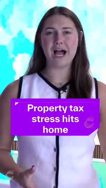
Property tax stress hits homeC
⤢ real
Box off-center right · too high Text centered Mark in chamfer
Florida's housing market: 3 surprising truthsC
⤢ real
Box full-width to edges Text flush-left Mark in chamfer
How hurricanes and rising costs are driving investors away from FloridaC
⤢ real
Box no max-width · fills frame Text centered · shrinks to fit Mark in chamfer
Is your home really safe from natural disasters?
C⤢ real
Box low-third, ok Text flush-left · italic Mark floated top-right · oversized
The gap, grouped
Placement
No shared origin. Each box's top-left anchor lands somewhere different: 10·527·575·598·61 (x·y %, hover the tiles). A locked template hits one point every time.
Off true center. Box centers read 50–52%, close, but the property-tax box drifts right (10% gap at left, 7% at right).
Vertical anchor wanders. Bottom inset swings 19%→28%, with no fixed baseline.
Size
Width floats with copy:83%→90% of frame width, no max-width cap.
Inner padding eyeballed: not one fixed token, so no two boxes share a rhythm.
Text
Alignment flips:centered (Property tax, How hurricanes) vs flush-left (Florida, Is your home), no rule.
Ad-hoc emphasis: italics on "really" in one clip, nowhere else.
Mark
Monogram has no rule: the "C" sits inside the chamfer on most boxes, is dropped entirely on some, and on the home-safe clip floats up to the frame's top-right as a loose watermark. Three different treatments, no token (see §03).
Platform
Sub-HD source. Every Reel sampled ships at 360×640, verified three ways (IG web GraphQL, the DASH manifest, and the private mobile media/info API all return only 360p transcodes), so the upload is sub-HD, not the platform downscaling. Masters should be 1080×1920 (see §05).
Safe-area collisions: a card run as video can lose its closing line under the IG scrubber (see §05).
Scope: this governs the Cotality-owned social-video lower-third, the violet motion card applied over 9:16, 1:1, and 3:4 outputs. Existing infographic cards, editorial photo cards, report covers, and partner-supplied footage overlays remain separate systems. The fix here is the repeatable lower-third template.
01 Color & legibility
The hue is right and consistent; keep it. The job here is guaranteeing the box reads over any footage, light or dark, busy or calm.
Contrast is already AA
White on #A805FB measures ~5.1 : 1: passes WCAG 2.1 AA for both normal and large text. Text stays pure white; never tint it.
Box, not hue, does the separating
Fill opacity 100%: the violet fully separates text from the video; no see-through boxes over busy frames (the rig's BOX OPACITY control ships at 100, and should never drop below ~92%).
Edge definition: a fixed soft shadow (0 2px 10px rgba(0,0,0,.28)) so the box holds on light/sky backgrounds (the gable + sky clips).
Never place white text directly on footage without the box; never run a second, competing caption style on Cotality's own posts.
02 Centering & placement
One alignment, one bottom line, one padding token, for every ratio. The boxes are already roughly centered; what kills 80% of the drift is locking the rest: text alignment flips left↔centered, the Y wanders (some too high), and the inner padding is eyeballed clip to clip.
center
bottom line
Property tax stress hits home
9:16 master
Alignment
Centered by default: box and text centered; that's the lock (the feed splits ~50/50 left vs centered today). The rig's ALIGN LEFT toggle is a deliberate per-series choice, never the per-clip flip you see now.
Horizontal
Box center = frame center. No left/right drift.
Bottom line
The box rests on a fixed line (a set inset above the safe-zone bottom), the same on every clip. Because the box is a fixed size, this line never moves and the Y never wanders.
Box size
Fixed per format: full frame width minus the 35px side margins, height a fixed 18.5% of frame. One predictable rectangle: the copy fits to the box, the box never resizes to the copy.
Max-width
Fixed. Copy wraps and auto-fits inside the box; it never grows or shrinks the box.
Inner padding
One token, not percentage-based: the rig's live PADDING control (default 40px) insets the triangle, line, and copy the same hard-pixel amount from every box edge, identical across all three masters. The mark-to-headline spacing is a separate, tighter value (TEXT GAP, default 16px) so the eyebrow groups with the headline instead of floating above it. Short copy doesn't tighten the frame; it leaves head-room below the top-pinned headline.
Type size
Default ≈ 4.5% of frame height (the headline's size ceiling, set off the composition so it's identical across ratios), then it auto-scales down to fit the padded band. Copy never overruns the box or grows it; it shrinks to belong. (Full type spec in §04.)
GEOMETRY
Box construction
The box already shares a constant across the feed, the chamfered bottom-right corner (where the optional "C" seats), and Cotality's own outro cards run the top-left triangle + divider-line marks. This codifies all of it as one repeatable build: a 9-slice asset for design tools, and a parametric comp in the AE rig that sizes the box from the composition, so the frame rebuilds identically in every format.
◳ Schematic · not to scale
40px
16px
Property tax stress hits home
Diagram, not to scale. Spacing is drawn large for legibility; the real box is flatter (≈ 2.85 : 1) with proportionally thinner margins and a bigger headline. The construction: 45° chamfer, top-left triangle + 2px line, a 40px edge padding on every side (the PADDING token), and the headline pinned a tighter16px below the triangle (its own TEXT GAP) so the mark groups with the copy. That pin is a fixed origin: the headline never jumps vertically between lines. The box is a fixed size per format, so shorter copy just leaves head-room below; the frame never changes.
Scaling
The corners (chamfer + triangle) and the top line hold their size; the body spans the box. The box itself is sized from the composition (full frame width minus the side margins, height a fixed 18.5% of frame height), so it rebuilds identically per format. Copy auto-fits inside it (it never grows the box), and no dimension ever distorts the chamfer's 45°.
Chamfer
Bottom-right corner cut at a true 45°: equal run and rise, one corner unit each way. The sampled Cotality box shipped at approximately 37°; standardizing to 45° makes the angle self-checking and repeatable in any tool.
Registration triangle
Top-left solid white right-triangle (arm ≈ 10% of box height) seated on the divider stroke: its top edge and the line share the same baseline, so they read as one mark, not two.
Divider line
Hairline (default 2px, driven by the rig's LINE WIDTH control) under the top edge, from the triangle to the right inset; separates an optional eyebrow from the headline.
Padding
One edge token (the live PADDING control, default 40px) drives every inset: triangle, divider, side margins, and the headline box. The headline top then pins a tighter16px below the triangle (its own TEXT GAP control) so the mark reads as part of the headline. Nothing dialed in by eye. (Both ship as live sliders in the After Effects rig.)
Monogram
Optional "C": when used, it seats inside the chamfer, bottom-right (see §03). Omitted on this build.
Corners
Square (no radius), except the chamfer.
03 Symbol-mark usage
The "C" monogram appears on some boxes and not others today. Because these posts live on Cotality's own channels, where the brand is already established, it's fine to make it optional. The rule is consistency when used, not mandatory presence.
Government shutdown threatens federal housing programsC
monogram locked
Usage
Optional, but all-or-nothing per series, not toggled at random (it's on some clips, off on others today). Either choice is fine if it's consistent within a campaign.
Position
When present: inside the box, bottom-right corner, fixed inset (6px @ master). One home, every time.
Size
Cap-height ≈ 1× the body line-height; never larger than the copy.
Clear space
Min one monogram-width of padding to the box edge and to the last line of copy; never let text collide with it.
Color
White at 92% on the violet. No outline, no drop shadow of its own.
Don't
Float it outside the box, scale it per clip, or duplicate it elsewhere in-frame.
04 Type & sizing
One typeface, one scale, one ceiling: copy adapts to the box, not the box to the copy.
One typeface, one weight:TWK Everett at 700. No italics, no mixed weights, no per-clip emphasis.
Size by frame, then auto-fit: the headline's size ceiling is ≈ 4.5% of frame height (so it scales identically across 9:16 / 1:1 / 16:9), and the rig auto-fits smaller to keep any copy inside the padded band.
Line-height ~1.2, target ≤ 3 lines. Longer copy auto-shrinks to fit; it never overruns or grows the box (rewrite to ≤ 3 lines for legibility).
Sentence case, no terminal period on a single headline.
TYPE pulled from cotality.com: headlines = TWK Everett (brand spec; this public build uses Space Grotesk as the web-safe stand-in), eyebrows/labels = IBM Plex Mono (Cotality's actual label font). Brand violet #A805FB, headline ink #1E1405.
05 Per-format + Instagram safe zones
The anchor, margin, and max-width are defined relative to each canvas, and on Reels/Stories the box must clear Instagram's UI no-go zones (the exact reason the coral card's last line vanished under the scrubber). 2026 specs:
Property tax stress hits home
9:16 Reel · 1080×1920 box clears the 450px bottom no-go
Reels: top no-go 220px, bottom no-go 450px (caption + right rail + scrubber), side margins 35px. The box bottom sits on the 450px line.
Stories: top and bottom no-go 250px each.
Feed (3:4 1080×1440 · 1:1 1080×1080 · 1.91:1 1080×566): no platform UI over the canvas, so the box uses its true 6% bottom margin.
Master & export
Master at 1080×1920 (9:16): the sampled feed shipped at 360×640, approximately 9× fewer pixels. It reads on a phone at a glance; full-screen or cast to a TV it is visibly soft, and it leaves no headroom for Instagram's own re-encode.
Export high-bitrate H.264/HEVC:16 / 14 / 12 Mbps per format (9:16 / 3:4 / 1:1) so Instagram downscales from a clean master instead of re-compressing an already-degraded 360p file. (Full recipe + QC in §06.)
Protect the violet & the white stroke: flat brand fills are exactly what low-bitrate 4:2:0 punishes (the #A805FB blocks up and the hairline divider can bleed toward purple). Higher bitrate + a master that isn't pre-compressed keeps the box on-brand. (Full recipe + QC in §06.)
Enforcement
Ship this as a locked motion-graphics template (After Effects MOGRT / Premiere) with the box, margins, padding, type scale, and the per-format safe zones baked in: editors type copy and pick a format; they can't move or restyle the box. The bible becomes a template, not a memo.
Built. A scripted After Effects rig generates all three master comps (9:16 / 3:4 / 1:1) with these exact rules baked in: 45° chamfer, triangle + 2px line, an auto-fitting headline, and a set of live controls (colour, alignment, line width, edge padding, text gap). It animates itself too (assembles in, holds for an adjustable beat, then slides out as one unit) and ships matching Adobe Media Encoder presets per format.
Hands it to a non-designer. The build auto-promotes the headline and every control into After Effects' Essential Graphics panel, so each comp exports as a MOGRT the instant it's built. A Premiere editor drops that template on the timeline and types a sentence; the rig makes every brand decision (placement, padding, type scale, colour, safe zones) on their behalf. The panel exposes only the editor-safe knobs (headline, colours, opacity, alignment, line width, padding, and the in/hold timing); brand-spacing like the eyebrow gap stays locked out of reach. The bible isn't a memo they have to remember; it's the few controls they're allowed to touch.
The AE rig expects TWK Everett 700 when installed; until then, the template uses its system fallback.
06 Compression & delivery
The flat brand fill is exactly what compression punishes: large areas of #A805FB band and block under low bitrate, and the hairline divider bleeds toward purple. This is the playbook that gets the violet through Instagram's re-encode intact.
Why it breaks
Flat violet → blocking & banding. 4:2:0 chroma subsampling plus low bitrate turn the smooth fill into 8×8 blocks and stepped gradients.
White line → purple bleed. The 2px stroke is thin enough that chroma from the adjacent violet bleeds into it: the line reads lavender, off-brand.
Sub-HD source compounds it. The current feed ships ~360p (see §05); a low-res master gives Instagram nothing clean to downscale from.
The recipe
Master
1080×1920 (and 1080×1440 / 1080×1080): never pre-shrink; hand Instagram a clean master and let it do the final downscale.
Codec
H.264 High / 5.1 (or HEVC for ~equal quality at lower bitrate), VBR 2-pass, fast-start.
Bitrate
Deliberately high so the re-encode starts pristine: 16 / 14 / 12 Mbps target (9:16 / 3:4 / 1:1), scaled to pixel count.
Colour
8-bit 4:2:0, Rec.709; Maximum Render Quality on; match the source frame rate.
Line
Bump the rig's LINE WIDTH from 2 → 4: a thicker stroke survives the downscale and resists the purple bleed.
QC · scrub at 100%
Violet: no blocking or banding across the fill. If you see it, raise the bitrate (or switch to HEVC).
White line + triangle: still crisp white, not bleeding lavender at the edges.
Chamfer: the 45° cut stays a clean line, no mosquito noise crawling the edge.
The three Adobe Media Encoder presets that bake all of this in ship with the AE rig download (§ Enforcement).
OUTPUT AE + AME proof
The QA tool audits still frames captured from public Cotality social video outputs. This production proof shows the other side of the workflow: source plate, AE correction, AME compression, then a social-resize stress pass.
Why this belongs here
The Bible defines the rule. It locks placement, safe zones, card shape, type, and compression expectations.
The AE rig applies the rule. The editor chooses the format and headline, while the rig makes the placement decision.
The QA tool verifies the frame. It checks still-image output from the motion system and flags drift before publish.
cotalityFollowSocial placement QA catches drift early
Reel, Instagram UI emulation
Corrected 9:16 motion output with the stricter Instagram overlay stress case.
The social-resize files are not an exact Instagram or Facebook server transcode. They approximate platform-style recompression by resizing each AME master to a 720-wide H.264 version. The point is to show that clean masters keep the violet card, white divider, chamfer, and face detail intact after another compression pass.
The Reel proof uses the full Instagram-style overlay because caption text, the bottom progress rail, and the right action rail create real placement pressure. Feed and square use a skinned control bar below the image area so the demo does not imply a false no-go zone.
The proof videos do not autoplay. Reviewers opt in to motion, which avoids starting a looping playback experience on page load and keeps this section friendlier for WCAG/508 review.
The simulation intentionally omits fake engagement counts. It only marks interface regions that can collide with placement.
Instagram Reels are treated as the stricter stress case. Facebook feed playback is usually quieter, so a layout that survives the Instagram overlay has more room on Facebook.
All three proof videos now carry the 3px divider candidate. It reads white after AME compression without making the mark feel heavy, so the AE rig defaults can lock to the same line width.
The still posters are PNG frames from the same masters, so the paused state does not add a separate JPG tint before playback starts.
Part II · Static · Stills & Carousels
Carousels = multi-image posts; each slide follows the same static rules below.
DIAGNOSIS
Healthier, but the card still floats
The static feed is in far better shape than video: the editorial photo-overlay card already carries the wordmark, headline, and footer consistently. Three things still drift, and several legitimate sub-systems share the grid.
Findings
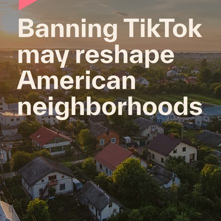
Headline anchor flips: bottom-left on most cards, top-anchored on others ("Banning TikTok…").
Eyebrow / category label is uneven: present on some cards, absent on others.
Scrim treatment varies: full dark vs. bottom gradient vs. none, so legibility over busy photos is inconsistent.
07 System map: one content type, one card
These are all legitimate. The rule is simply: a content type always uses the same card, and artwork is never reposted across systems without adapting (the coral card-as-video safe-area issue from Part I).
One rule across every editorial card: a category label in IBM Plex Mono above the headline, or none. Pick one.
Scrim
Fixed bottom gradient (dark → transparent, ~60% height) so white headlines clear AA over any photo, same legibility logic as Part I.
Footer
Optional URL or handle, bottom-left, fixed inset, IBM Plex Mono.
Color
Violet accents only; coral is reserved for the infographic system, never mix it into the editorial card.
09 Type & sizing (static)
The same two faces as the motion box, set for a still frame. Sizes key to the card, so a 1:1 and a 4:5 read as the same system at two crops.
Headline
TWK Everett 800, white, left-aligned on the bottom-left baseline. It is the dominant element: sized so a full headline fills the lower band above the footer, max-width ~74%, target ≤ 3 lines. Longer copy gets rewritten, never shrunk into a caption.
Eyebrow
IBM Plex Mono, uppercase, tracked, one line above the headline. Per the §08 rule, every card in a series carries one or none of them does.
Wordmark
Lowercase cotality, top-left, fixed inset, white. Held small so it never competes with the headline.
Footer
IBM Plex Mono, bottom-left, fixed inset, one muted line for a URL or handle when used.
Ink on light cards
On the light-field systems (report cover, data card) the headline drops to brand ink #1E1405 on white, with violet as the accent. The photo card stays white-on-scrim.
10 Format & safe zones (static)
Static posts do not fight a scrubber or a caption rail the way Reels do, but the feed crop and the profile grid still clip a card that ignores them. Three ratios, one grid.
Ratios
4:5 feed
1080×1350, the tallest the feed allows and the default for reach. The editorial card is designed here first.
1:1 square
1080×1080, the safe universal. A 4:5 card must keep its wordmark and headline inside the centre 1:1 so the profile-grid crop never beheads it.
1.91:1 link
1080×566, link and landscape cards only. Headline and wordmark pull toward the centre to survive the wider crop.
Watch
Profile grid centre-crops every post to 1:1. Keep all brand-critical type inside that centre square.
First caption line truncates at ~125 characters before "more"; lead with the point, never with a hashtag.
No reposting motion artwork as a still. A frame pulled from a Reel was composed for 9:16 and its safe zones; re-crop and re-set it, do not screenshot it.
profile-grid 1:1cotality
Insurance is the new barrier to homeownership
4:5 feed · keep type in the centre 1:1
cotality
Insurance is the new barrier to homeownership
1:1 square
cotality
Insurance is the new barrier to homeownership
1.91:1 link
11 Carousels
A carousel is one card repeated, not five designs. The grid that locks a single editorial card locks every slide.
Cover slide
The hook: editorial card, full grid, the strongest headline. It is the only slide most of the feed will see, so it earns the scroll on its own.
Content slides
Same margins, same wordmark position, same type scale. Only the photo and copy change. A slide that breaks the grid reads as a different account.
Continuity
A small slide counter or a consistent right-edge swipe cue, in the same spot on every slide, so the set reads as one object.
Mixed systems
A carousel may move from editorial card to data card to coral infographic, but each slide obeys its own system's rules. The set is held together by margins and type, not by forcing one layout onto all of them.
cotality
Insurance is the new barrier to homeownership
›
cotality
Premiums outpaced incomes in 38 states
cotality
What buyers can do before they bid
one card repeated · same grid every slide
12 The other systems, briefly
§07 named the five. The editorial card is fully governed above; the rest each get one rule so a designer knows which lane they are in.
Report cover
Title-led on a light or muted field, TWK Everett ink on white, violet accent. No photo-overlay headline; this is a cover, not a card.
Coral infographic
The only place coral appears. Black type on coral, the dotted-C mark, a data-narrative layout. Coral never leaves this system, and never enters the editorial card (the §08 colour rule).
Data card
White field, violet charts and accent, a single stat or one series. Minimal, legible, no photo.
Event / people photo
Documentary. Wordmark only, minimal or no headline. Let the photograph carry it.
ENFORCEMENT
Lock the card, not the memo
The same move as the motion rig, on the static side. The four corners of the editorial card become a component, not a guideline, so the easy way to make a post is the on-brand way.
How it ships
Build the editorial card and the carousel as a locked template, a Figma component or a Canva / Adobe Express brand template, with the wordmark, margins, scrim, headline band, and type baked in as fixed properties. A social manager drops in the photo, types the headline, picks a category, and exports. They cannot move the wordmark, restyle the headline, or reach for coral, because those are not editable. The grid that drifts today becomes the one thing they no longer have to think about.
It is the Part I lesson carried across: the bible stops being a document people are asked to remember and becomes the only path the tool offers.

 ⤢ real
 ⤢ real
 ⤢ real
 ⤢ real