
SoLo Funds design audit
A three-track review of the SoLo Funds brand and product surface: brand-system consistency, UX friction mapped through Friction Inversion, and WCAG 2.2 / Section 508 accessibility. Built before the conversation, because the clearest way to show how I work is to do the work.
An audit should practice what it preaches. This report passes WCAG AA in Day, Night, and High-Contrast modes. Try the toggle, top right.
SoLo ships a confident, distinctive brand: Druk Wide display type, a warm orange and cream palette, the rotating coin motif. The gap is not taste, it is governance. The production theme has no design tokens, so the same intent is re-typed as raw values across hundreds of rules, and the brand drifts as a result.
Palette, as extracted from the live theme
B-01
No design tokens: the system is hardcoded values
8.6
Finding
The theme defines zero CSS custom properties across 5,694 lines. Every color, type size, and radius is written as a literal value, so the brand lives as 314 hardcoded hex colors scattered through 990 page-template-scoped selectors. There is no single source of truth, so a brand change means a find-and-replace across the stylesheet, and intent silently forks (see B-02).
Evidence, measured from style.css
style.css                       →  5,694 lines, 130 KB
:root { --* } custom properties →  0
hardcoded hex color literals    →  314
.page-template-* selectors      →  990   (per-page overrides, not shared tokens)
#F5873A (brand orange) repeated →  20 times
Why it matters
This is the foundation a design system is built on, and it maps directly to the Month 3 milestone. Tokenizing the existing palette and type scale into CSS variables is a low-risk, high-leverage first move: it makes the brand governable, makes accessibility fixes global instead of per-rule, and collapses the hundreds of page-scoped overrides into a handful of semantic aliases.
B-02
Brand colors are not single-sourced
7.6
Finding
Because there is no token (B-01), the same brand color exists as more than one value. The primary orange appears as both #F5873A and #F5863B. The green family is four uncoordinated values used interchangeably for buttons, gradients, and surfaces.
Evidence
orange  →  #F5873A  and  #F5863B   (two "primary" oranges)
green → #617831 (olive) · #24BB67 · #009499 · #007478 (one role, four values)Recommendation
Collapse to one canonical --color-brand and a named green scale. The drift is invisible in isolation and obvious side by side, which is exactly the kind of error a token layer prevents by construction.
B-03
Two display typefaces compete across templates
5.7
Finding
Headlines use Druk Wide on most pages but switch to Poppins on the Solo IQ, Bankroles, and landing templates. Body text is GoghVariableGX in most places and Poppins in others. The voice changes depending on which template a visitor lands on.
Evidence
default / home / community  →  'Druk Wide'
solo-iq / bankroles / lp     →  'Poppins'
body                         →  'GoghVariableGX'  (Poppins on #poppins templates)
Recommendation
Define a type system with one display face and one text face, mapped to semantic roles. If Poppins is intentional for a sub-brand, scope it as a named theme rather than a per-template override.
B-04
Defects shipped in the production stylesheet
5.2
Finding
Several rules in the live theme are broken or placeholder, which means parts of the intended design never render. These are caught by a linter in seconds and point to a missing CSS quality gate.
Evidence
.filter .active   →  background-image: url(.../ICON_NAME_HERE.svg)   (placeholder shipped)
footer a          →  text-decoration: ffffff;   (invalid value, rule ignored)
.header-images    →  // border-radius: 24px;   (// is not a CSS comment; line is invalid)
Recommendation
Add stylelint to CI. Each of these is a one-line fix, but their presence in production signals there is no automated check between authoring and deploy.
B-05
The brand display face ships without a woff2
3.2
Finding
The deployed site already self-hosts its fonts well: every face carries font-display: swap, and the body face GoghVariableGX and all of Poppins are served as woff2. One gap remains. Druk Wide, the brand display face, is delivered as an .otf with no woff2, so it downloads larger than it needs to and is not subset to the characters a headline uses.
Evidence, from the live font stylesheet
GoghVariableGX  →  woff2 + ttf     font-display: swap
Poppins         →  woff2           font-display: swap
Druk Wide       →  .otf only       font-display: swap   (no woff2)
Recommendation
Add a woff2 for Druk Wide and subset it to the headline character set. This is the last mile of a font setup that is otherwise already optimized, so it is a small, isolated win.
B-06
A modern image pipeline, undercut by one GIF and over-compressed photos
5.1
Finding
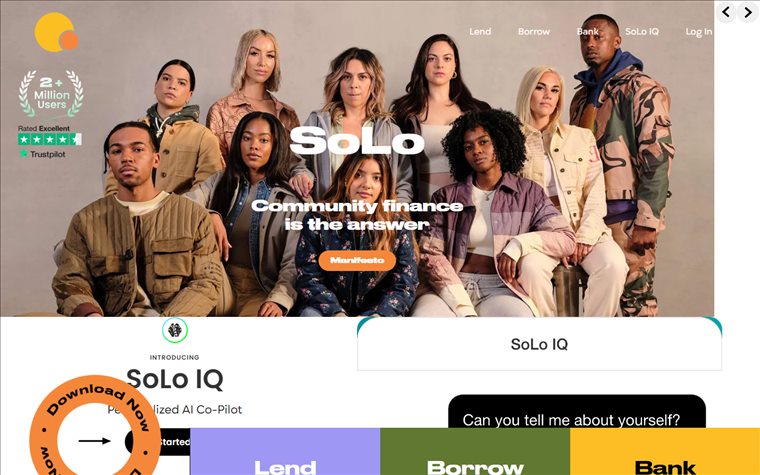
Credit where it is due: the homepage already serves images as WebP through an optimizing CDN, and the total image payload is light. Two things pull it back down. The single heaviest asset is a half-megabyte animated GIF, and the hero photography carries visible compression banding, the kind that reads as cheap on an otherwise premium brand.
Evidence, measured from the live page
image requests          →  13   (1.43 MB total over the wire)
content images via WebP CDN →  6    (.bv.webp)
heaviest single asset   →  0.50 MB animated GIF  (SoLo IQ chat)
hero and section photos →  visible banding and blocking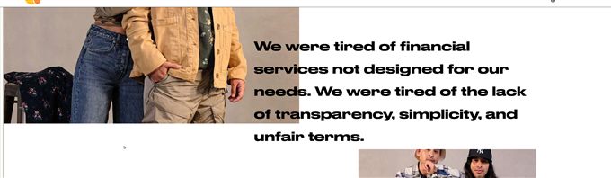
Recommendation
Replace the GIF with a muted autoplay video or animated WebP, which typically cuts its weight by around eighty percent. Raise the CDN quality for hero photography, where banding shows most, and keep aggressive compression for flatter graphics. The WebP pipeline itself is the right foundation, worth keeping.
SoLo is a peer-to-peer lending app whose users often have the least margin for error. That raises the stakes on UX friction: a confusing field or an unanchored decision is not a minor annoyance, it is a barrier to capital. This track maps each friction point through Friction Inversion: the principle that the correct action should be the path of least resistance.
 How to read this track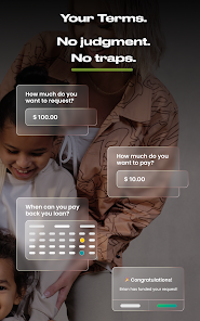
Friction findings
U-1
The product is gated behind a connected bank account
8.2
Friction score
Current state
A new user cannot browse the marketplace, see real requests, or judge whether the model fits them without first linking a bank account. The highest-trust action the app will ever ask for is the price of admission to look around.
Why it matters
SoLo's users are often the most cautious about granting financial access and the most exposed if it goes wrong. Demanding the deepest commitment before returning any value inverts the trust curve: maximum risk, zero context. It also blocks evaluation, which is the reason this audit leans on external captures.
Friction Inversion opportunityU-2
The cost of borrowing is framed as an optional "tip"
8.0
Friction score
Current state
The borrow flow asks "How much do you want to pay?" and the marketplace lists that amount to lenders as a "Lender Tip," for example $30 on a $550 request. Functionally this is the price of the loan and the lender's yield, but the label "tip" frames it as optional rather than as the cost it is. The borrower is left to infer what amount gets the request funded, while lenders filter and sort by tip percentage.
Evidence
borrow flow   →  "How much do you want to pay?"   ($10 on $100)
marketplace   →  "Lender Tip: $30.00 (5%)"   ·   filter: "Tip Percentage"
borrower note →  "Bills; Max Tip $30;"
Friction Inversion opportunityU-3
A public reason field sits beside score and tip
6.4
Friction score
Current state
Each request shows a public free-text "Reason" beside the borrower's Solo Score and tip, for example "emergency vet bill," and lenders browse these as a feed. If the reason and tip influence how quickly a request is funded, the design quietly favors disclosing more and tipping more.
Evidence
Solo Score 99 · Requested $550 · Lender Tip $30 (5%) · Reason: emergency vet billFriction Inversion opportunityU-4
Account errors dead-end into an email address
7.5
Friction score
Current state
A publicly posted capture shows the marketplace covered by a modal: "Oops! There is an error with your account that has caused it to become blocked. Please contact help@solofunds.com." The only control is "Got It." No reason, no in-app path, no timeline, on the screen the user opened to move money.
Evidence
title    →  "Oops!"
body     →  "...your account ... has become blocked. Please contact help@solofunds.com..."
actions  →  [ Got It ]   (dismiss only; no cause, no recovery)
Friction Inversion opportunityU-5
The wallet blends spendable cash with SoLo Credits
5.6
Friction score
Current state
The wallet headline sums Cash and SoLo Credits into one balance, both in the same amber, and the transaction list carries a second unlabeled figure beside each amount. A user asking "how much can I actually withdraw" has to infer the answer.
Observed on a wallet screen with sample data, so this is a structure and hierarchy note, not a live-balance claim.
Friction Inversion opportunityColor contrast measured from the live theme, foreground over background exactly as the CSS pairs them. Every ratio below is computed, not asserted. The headline: the primary call to action fails WCAG AA, and the white-on-color pattern fails across orange, purple, and yellow. The fix pattern is encouraging, because black text on the same orange and yellow already passes.
Measured contrast, as used
| Pair, as used | Ratio | AA |
|---|---|---|
White on orange #F5873A · primary CTA | 2.50 | Fail |
Orange #F5873A text on white · links | 2.50 | Fail |
White on purple #9E98F4 | 2.55 | Fail |
White on yellow #FCBE24 | 1.68 | Fail |
Gradient green #24BB67 heading on white | 2.51 | Fail |
Gray #B3B3B3 caption text on white | 2.10 | Fail |
Black on orange #F5873A | 8.41 | Pass |
Black on yellow #FCBE24 | 12.53 | Pass |
White on teal #007478 | 5.57 | Pass |
White on olive #617831 | 4.95 | Pass |
W-01
Primary call to action fails contrast
9.1
Finding
White text on the brand orange #F5873A measures 2.50 to 1, well under the 4.5 to 1 required for normal text. This is the primary button hover state and the floating download button, so it sits on the most important conversion path in the product.
Evidence
foreground #FFFFFF  /  background #F5873A   →   2.50 : 1   (AA needs 4.5 : 1)
sources: .btn-primary:hover, #download-button
Recommendation
Two clean options, both already proven in their palette. Use black text on the orange, which measures 8.41 to 1 and passes comfortably, or darken the orange to roughly #B45309 for white text. Black on orange keeps the energy of the brand while clearing AA.
W-02
Orange as link and interactive text fails on white
7.7
Finding
Orange #F5873A set as text on a white surface measures 2.50 to 1. It is used for text links and the .btn-text call-to-action pattern, so interactive affordances are hard to read for low-vision users.
Evidence
#F5873A on #FFFFFF   →   2.50 : 1   (fail)
sources: .btn-text, in-content links, .page-template-service #slider .btn-text
Recommendation
Reserve orange for large display use and fills with black text. For inline links and small interactive text, use a darker brand value such as the existing teal #007478 at 5.57 to 1, or an orange darkened to meet 4.5 to 1.
W-03
White-on-color surfaces fail across purple and yellow
7.2
Finding
The white-text-on-color pattern is applied to surfaces that are too light to carry it. White on soft purple #9E98F4 is 2.55 to 1, and white on yellow #FCBE24 is 1.68 to 1, which is effectively unreadable.
Evidence
#FFFFFF on #9E98F4 (.bg-purple)   →   2.55 : 1   (fail)
#FFFFFF on #FCBE24 (nav hover)    →   1.68 : 1   (fail)
#000000 on #FCBE24                →  12.53 : 1   (pass, already on the .solofunds circle)
Recommendation
Switch text on light fills to black, which their own coin component already does on yellow. Codify a rule in the token layer: light surfaces take ink text, dark surfaces take white. This is the kind of decision a token system enforces automatically (see B-01).
W-04
Gradient headings and gray body text fail on white
5.9
Finding
The green gradient eyebrow and heading style (.h9) renders text at #24BB67 over white, measuring 2.51 to 1. Secondary gray text at #B3B3B3, used for captions such as the Solo IQ slide text, measures 2.10 to 1. Both fail AA for the small sizes they are used at.
Evidence
#24BB67 on #FFFFFF (.h9 gradient text)   →   2.51 : 1   (fail)
#B3B3B3 on #FFFFFF (Solo IQ slide captions) →   2.10 : 1   (fail)
Recommendation
Darken gradient text toward the teal end and below, and lift secondary gray to at least #767676 for 4.5 to 1 on white. Reserve the bright green for large or decorative use only.
W-05
Header navigation is light text over photography
7.4
Finding
Over the hero, the header renders the primary navigation (Lend, Borrow, Bank, SoLo IQ, Log In) as light text directly on the photograph, with no scrim behind it. Where the photo is light, which is most of the hero, the links fall below the 4.5 to 1 minimum, and because the backdrop is an image the exact ratio shifts from pixel to pixel.
Evidence
header over hero              →  background: transparent
#menu-primary-navigation a    →  color: #ffffff
result                        →  white nav on a light group photo, no scrim
Recommendation
Guarantee contrast independent of the photo: add a subtle gradient scrim behind the header, or give the nav a solid background from the start rather than only after scroll. This is the one contrast issue here that varies with content, which is why it needs a structural fix rather than a single color change.
The whole audit has one throughline: a missing token layer. No tokens (B-01) lets the brand drift (B-02) and makes every contrast failure a separate accident (W-01 through W-05). So the fix is one artifact, not a dozen. Below is the first version of that layer, with the Track 3 failures already resolved, and the primary fix shown in context. This is where the Month 3 design system starts, and it is roughly a day of work.
The primary fix, in context
Contrast resolutions
| Role | Current | Proposed |
|---|---|---|
| CTA and color fills | white on orange 2.50 | ink on orange 8.41 |
| Link text | #F5873A 2.50 | #BF540A 4.68 |
| Muted text | #B3B3B3 2.10 | #767676 4.54 |
| Success / eyebrow text | #24BB67 2.51 | #1A884B 4.50 |
| Purple surface | white on purple 2.55 | ink on purple 8.25 |
| Yellow surface | white on yellow 1.68 | ink on yellow 12.53 |
The token foundation
:root{
  /* surfaces */
  --color-bg:#FFFFFF;  --color-surface:#F3F1EC;  --color-ink:#1A1A1A;

  /* brand fills - always paired with ink text */
  --color-brand:#F5873A;          /* CTA orange · ink on it = 8.41:1 */
  --color-accent-yellow:#FCBE24;  /* ink = 12.53:1 */
  --color-accent-purple:#9E98F4;  /* ink =  8.25:1 */
  --on-fill:#000000;

  /* fills that carry white text */
  --color-teal:#007478;           /* white = 5.57:1 */
  --color-olive:#617831;          /* white = 4.95:1 */
  --on-dark:#FFFFFF;

  /* text colors - all >= 4.5:1 on white */
  --text-muted:#767676;           /* was #B3B3B3  (2.10 -> 4.54) */
  --link:#BF540A;                 /* was #F5873A  (2.50 -> 4.68) */
  --success-text:#1A884B;         /* was #24BB67  (2.51 -> 4.50) */
}
Adopting this is a day, not a quarter: define the variables once, then swap the repeated hex literals for them. Every Track 3 failure is resolved by construction, the brand drift in B-02 cannot recur because there is one source of truth, and the orange, yellow, and coin energy of the brand is untouched. The fixes move text and pairings, not the palette. This file is the seed of the design system the role asks for in Month 3.
The throughline across all three tracks is a single missing layer. SoLo has a strong brand and a real product, but no design system underneath them, so consistency, accessibility, and velocity all pay the same tax. Tokenizing the existing brand is the highest-leverage first move, and it is exactly where the role's roadmap points.
Alignment with the role roadmap
| Stated milestone | This artifact |
|---|---|
| Month 1 · Audit brand and product suite | This report, across Tracks 1, 2, and 3. |
| Month 1 · Identify optimization areas | Sixteen findings, prioritized by severity. |
| Month 2 · Define a visual North Star | Directional, with a contrast-safe token starter delivered in the Proposed tab. |
| Month 3 · Formalize a design system | A first token foundation is sketched in the Proposed tab, ready to build on. |
Compliance posture
A fintech accessibility obligation
SoLo handles money for the users who can least afford to be locked out, so contrast failures on the primary lending path are an inclusion issue first. ADA Title III makes accessible design an obligation here, not only a preference.
The fix pattern is favorable
The critical contrast failures resolve with black-on-orange and black-on-yellow, treatments already present in the brand. This is a governance fix, not a rebrand.
About this audit
Track 1 reflects direct inspection of the live SoLo Funds theme stylesheet, plus a live capture of the homepage with Playwright that recorded every image request and its weight. Track 3 contrast ratios are computed from the extracted colors with the standard WCAG relative-luminance formula. Track 2 draws on SoLo's own product renders, publicly posted user captures, and an onboarding gate observed directly, since the app blocks browsing behind a bank-account link. Each finding is scored 0 to 10 as a weighted composite of user impact, scope, and inverse fix complexity.